
- Like
- SHARE
- Digg
- Del
- Tumblr
- VKontakte
- Flattr
- Buffer
- Love This
- Save
- Odnoklassniki
- Meneame
- Blogger
- Amazon
- Yahoo Mail
- Gmail
- AOL
- Newsvine
- HackerNews
- Evernote
- MySpace
- Mail.ru
- Viadeo
- Line
- Comments
- Yummly
- SMS
- Viber
- Telegram
- JOIN
- Skype
- Facebook Messenger
- Kakao
- LiveJournal
- Yammer
- Edgar
- Fintel
- Mix
- Instapaper
- Copy Link

One hundred American dollars being printed. Selective focus. Horizontal composition with copy space. … [+] Money printing concept.
getty
Fed officials talk about how rates will be kept low for the time being. The bond market seems to have other ideas. It’s one of those times when what they’re saying and what the market is actually doing are different.
What can be learned about this apparent disconnect by examining a weekly chart of the 10-year Treasury yields?
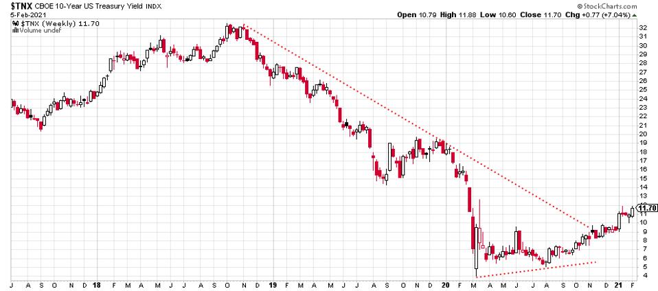
10-Year Treasury yields, weekly chart, 2 5 21.
stockcharts.com
For one thing, it’s clear that the long-term downtrend in yields has ended. That’s evident from the red-dotted line that connects the 2018 highs with the late 2019 highs. Yields broke above that line late last year. Note also that higher lows are in place from March, 2020 to August, 2020.
What had been going down for years is now headed back up. That upward movement is enough to say that a new trend is emerging. This has important ramifications for almost all asset classes.
Here’s the shorter term, daily view of the 10-Year yields chart:
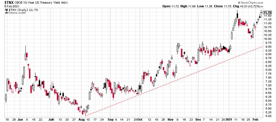
10-Year Treasury yields chart, daily 2 5 21.
stockcharts.com
As rates rise, it becomes more expensive to use credit cards. Less use of credit cards would mean less buying of consumer goods, typically. As rates rise, it costs more to borrow money in other ways, such as loans from banks and when mortgages are required to finance home purchases.
This may seem obvious but it’s important to consider carefully when some fundamental analysts tell you that chart analysis is pointless. This is not true. All you have to do is look at the yield chart for the Treasury note and you can see for yourself where rates have been and how much is changing.
One other thing about rates going up: if you have a margin account it will cost more to borrow to buy stocks or to sell them short.
Lots of effects when you stop and think about it. Eventually the whole economy adjusts to higher rates.
Bond prices are dropping as rates rise. Here’s the weekly chart of the benchmark iShares 20+ Year Treasury Bond ETF ($TLT):
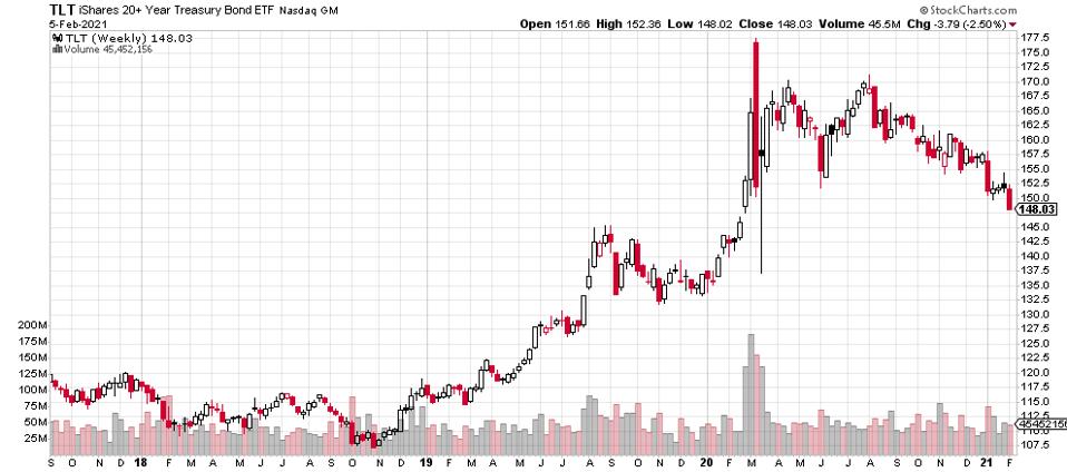
iShares 20+ Year Treasury Bond ETF weekly price chart.
stockcharts.com
Bond prices peaked last March during the extraordinary dislocations of all markets. Take a look at the nice bit of volume during that month. Treasuries had been rising in price since those late 2018 lows.
Here’s the daily chart of this benchmark bond ETF:

iShares 20+ Year Treasury Bond ETF daily price chart, 2 5 21.
stockcharts.com
This week’s selling took the price below the low of earlier in the year, typically not a bullish sign. Note that the selling has been steady since the early August, 2020 peak with some minor back and forth along the way.
It’s the flip side of the rates chart. You can see price going the other way. Again, that’s the benefit of studying price charts and rates charts. It’s possible to determine whether a narrative such as “interest rates will kept low” might be right or wrong. With technical analysis, the picture is clear.
I do not hold positions in these investments. No recommendations are made one way or the other. If you’re an investor, you’d want to look much deeper into each of these situations. You can lose money trading or investing in stocks and other instruments. Always do your own independent research, due diligence and seek professional advice from a licensed investment advisor.

